Story: Look for potential
In a previous Blog about Wix, I was honestly surprised by what Wix can do. It may be more flexible than ordinally WordPress theme. It was Wix YouTube channel. So, I can understand why it’s high quality.
In this blog, I would like to correct the inspired Wix website.
HERoines
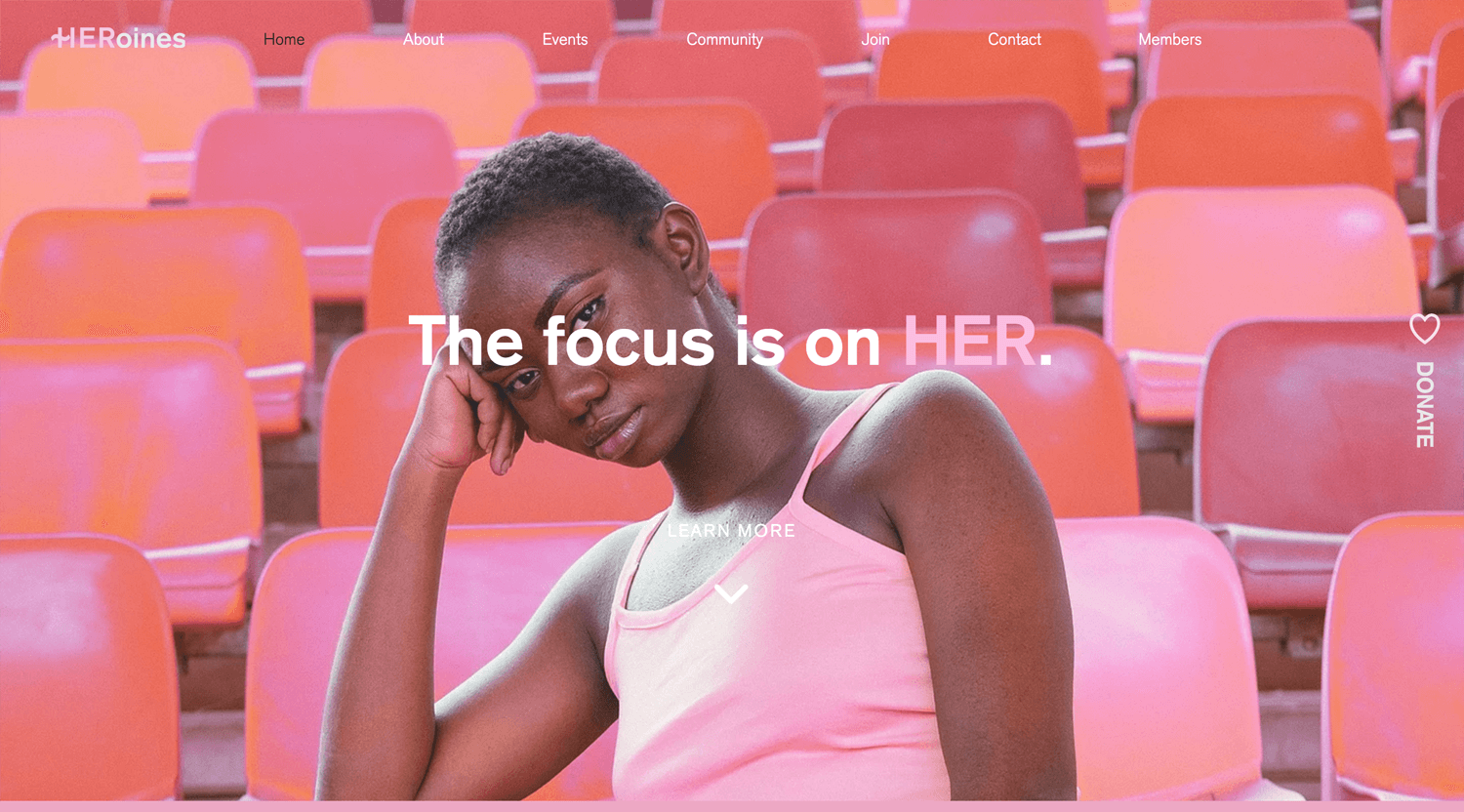
©Wix
– Vertical donate button
– Color palette
– Horizontal loading text
– Scroll color transition
– Horizontal loading text
The balance of the third section is good. If I have completed color pallets and a client does not have many attractive images, I would like to use this layout.
*Website has some small issues, width.
Gym by Wix Template
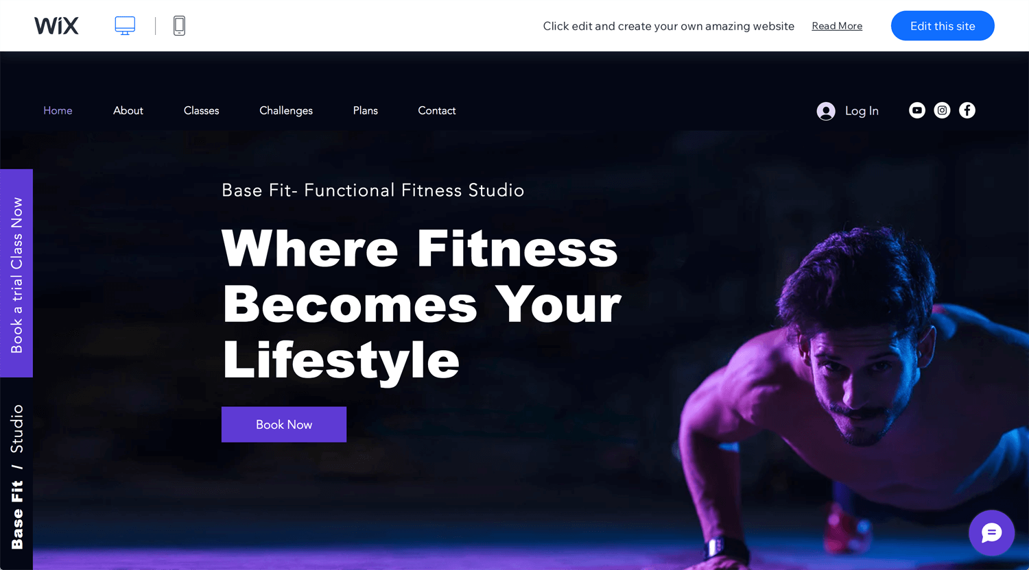
©Wix
This is a template, but I can see good points. Position fixed on the booking button, but it is not on the header. So, it catches a user’s attention. Bold fonts suits the gym theme. Video, parallax, and image on 4th section is a good rhythm.
Daniel Aristizabal
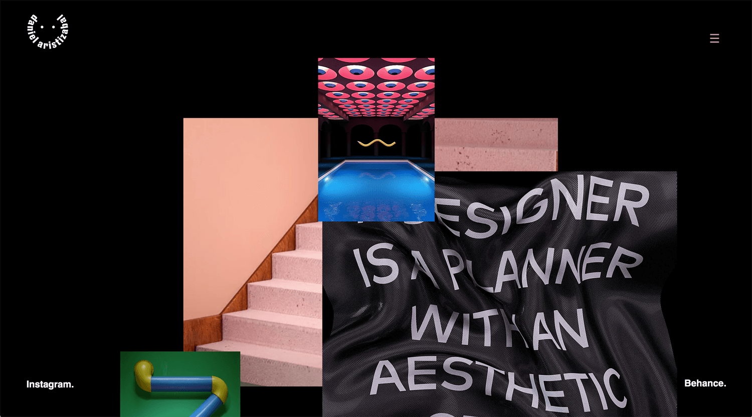
©Daniel Aristizabal
– Image revealing
The combination of video and image looks useful. Logo, humbarger menu and 2 social media on the corner, fixed position, are minimum. Image installed hover action, but it does not link. It makes me confused. High-quality graphics/images cover small issues. Images apply art direction. Maybe Wix has an issue. When I scroll and back to the hero section, images do not show up. Anyway, this is good work.
Daniel Aristizabal
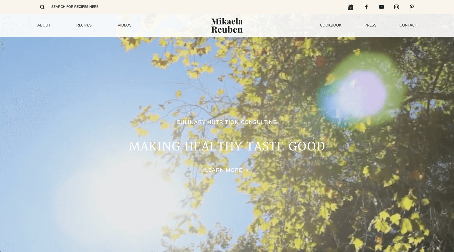
©Mikaela Reuben
– Ballance of full width and padding width
– Usage of video and picture
Obviously, she is using a photographer. It raises her value. In other words, a low-budget client does not contact her. She chose the right designer. Video, photo and website have consistency.
Ivy Chen
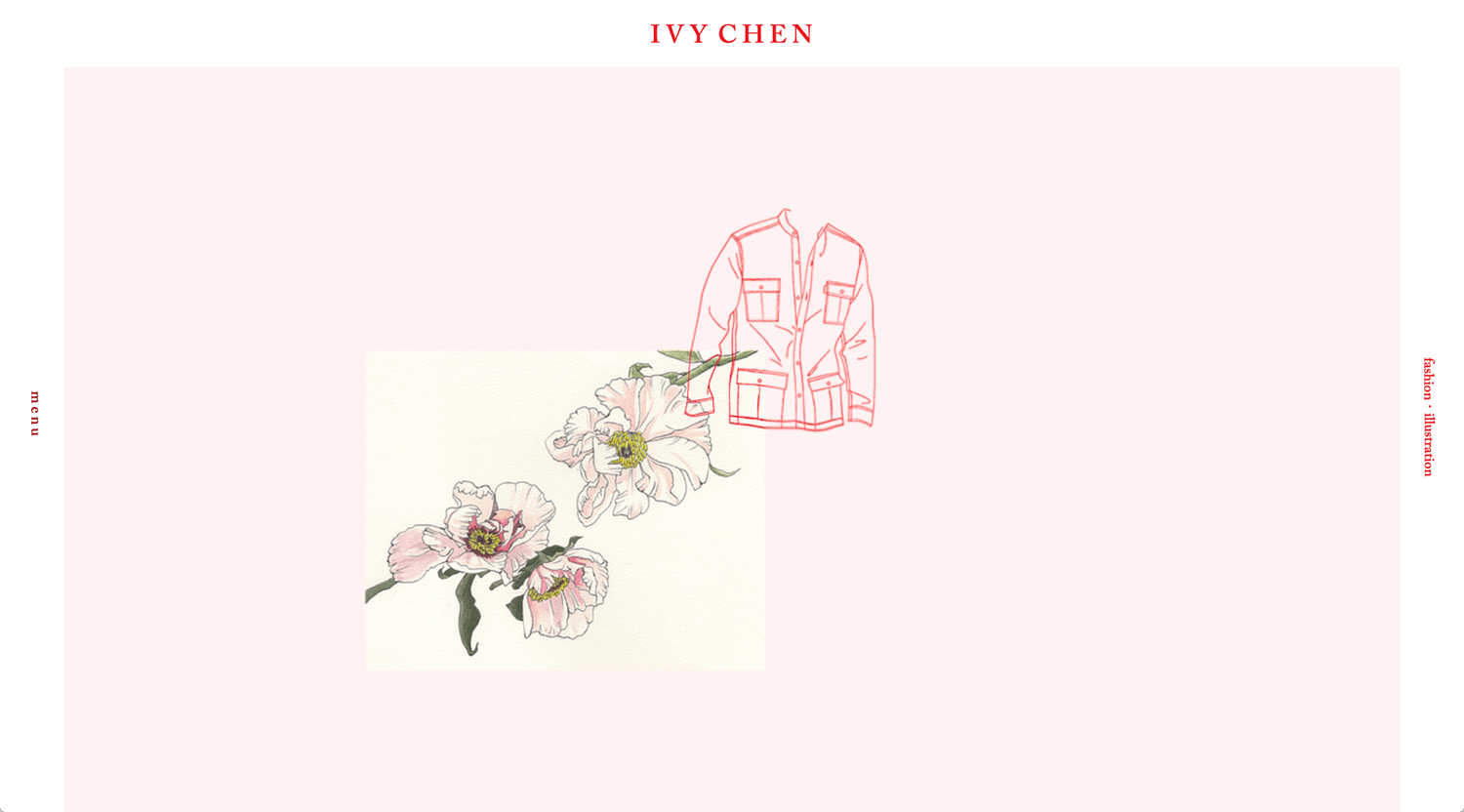
©Ivy Chen
– Parallax scrolling
During the Wix website research, I often found this fixed frame style. It is not so unique, but it still works. The full-screen menu, bold red background, is sharp. This is a textbook for parallax usage. Hero and 2 sections look the same order, illustration, product and scene photo, but it changes the 3 and 4 sections intentionally. The direction of illustration, style and tone of the website, typography all fit and consistent.
Felitasari Rekso
©Felitasari Rekso
– Percentage of position fixed and graphics
I think this portfolio is for recruiting rather than looking for clients. I was thinking about who is a target audience, who will contact the designer, but I could not figure it out. This is not criticism. Many designers, included me, should reflect on their portfolios.
I assume that a designer is still young, enough talent for graphic design. The majority of businesses need a solution, not an art.
Dalya Green
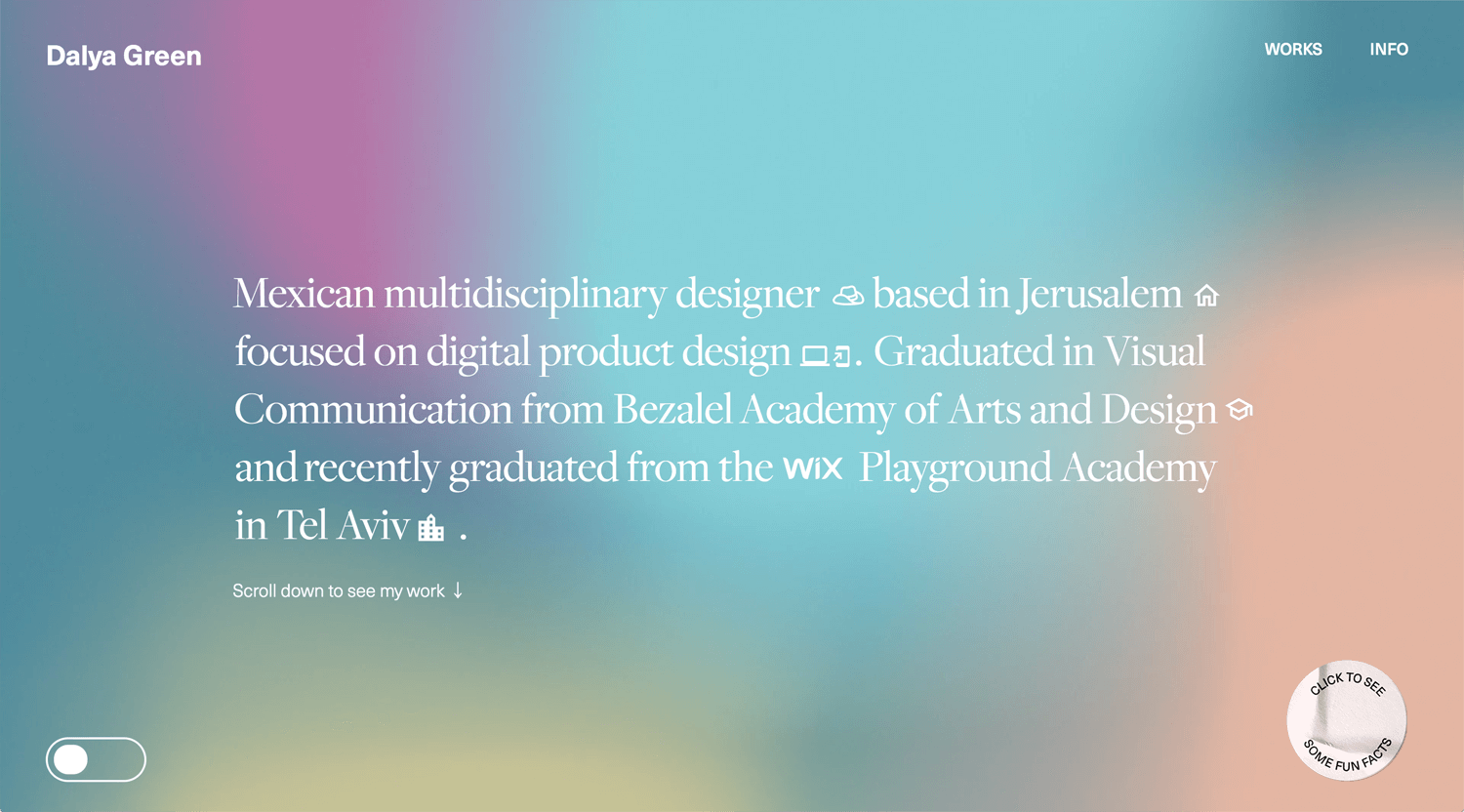
©Dalya Green
– Hover action
Variety of works. The background of the hero section and animation catches the user’s attention. A well-described process on the project page. Appropriate usage of sticky interaction. Good job!
Run Wild Design
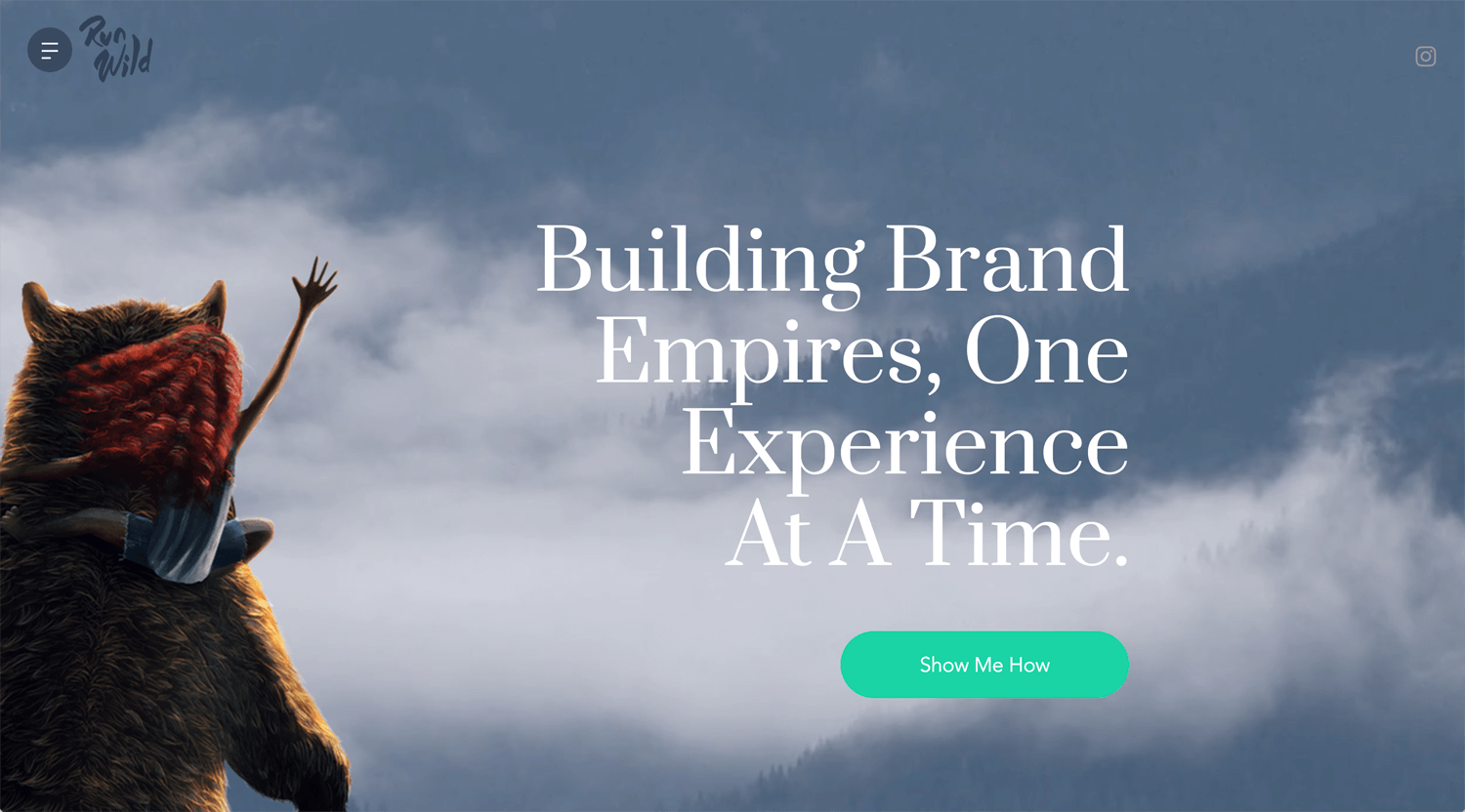
©Run Wild Design
– Perspective
– Font size
Many blogs feature this website as a good Wix website. Nice hero section. It’s wild. Portfolio for gaming, high-quality illustrations shows his/her talent(or team?). The process does not show the process actually. I should emulate connecting a shop page on the portfolio. Overall, talented!
Lena Steinkuehler
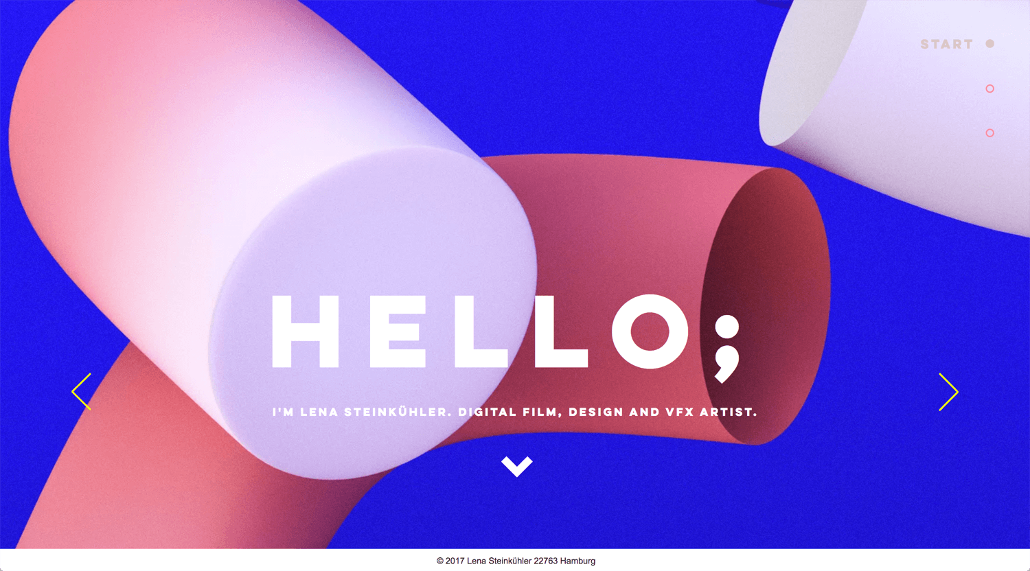
©Lena Steinkuehler
– Good grid gallery
VFX itself is a good job. There is a rhythm in the grid layout. She can replace some images with video/animation. It will be quick communication. I have no skills for 3D right now. Someday.
Elena Iv-skaya
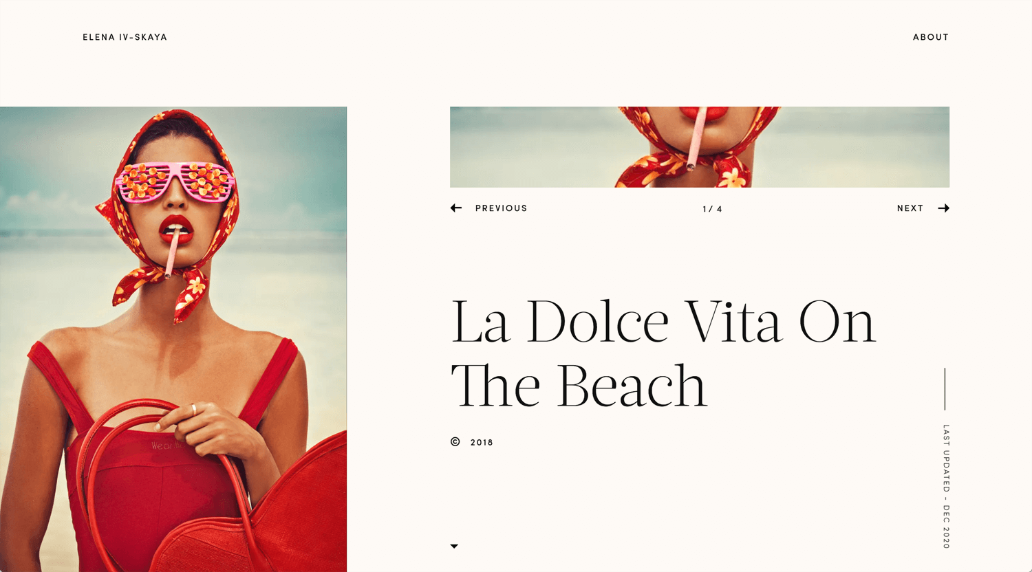
©Elena Iv-skaya
– Slideshow on hero section
– Layout, white space
Artistic photography fits this layout. I don’t know how much she was involved in the art direction and styling. This is not the Wix website, but learn from this website, typography, rich white spacing, and image revealing.
conqr.
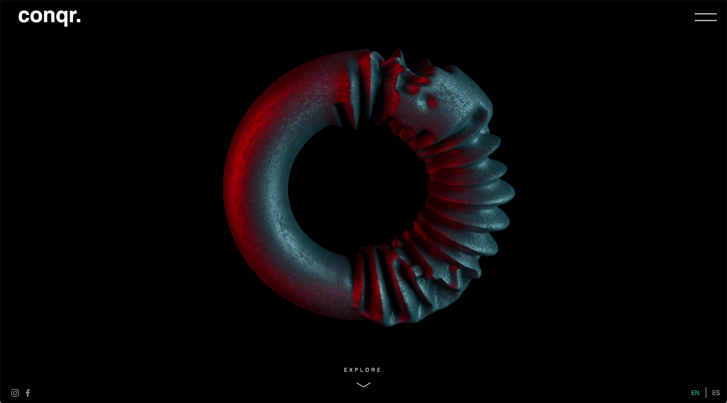
©conqur.
– High-quality 3D graphics with a seamless background
I cannot recommend emulating this website if you are looking for an ordinary business client. The 3D graphics do not relate to much business. The 3D graphics and portfolio have a gap. This website is good, but you can stay basic, value proposition with CTA at hero section.
Calvin Pausania
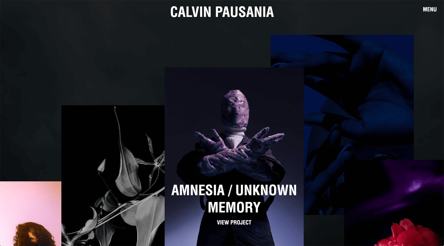
©Calvin Pausania
– Many photos on the video background, but still navigate where the user goes
I checked an about page, but he does not say who he is quickly. He is an artist. So, it is okay this way. The website chooses a client. The niche is good.
Wix Playground Academy
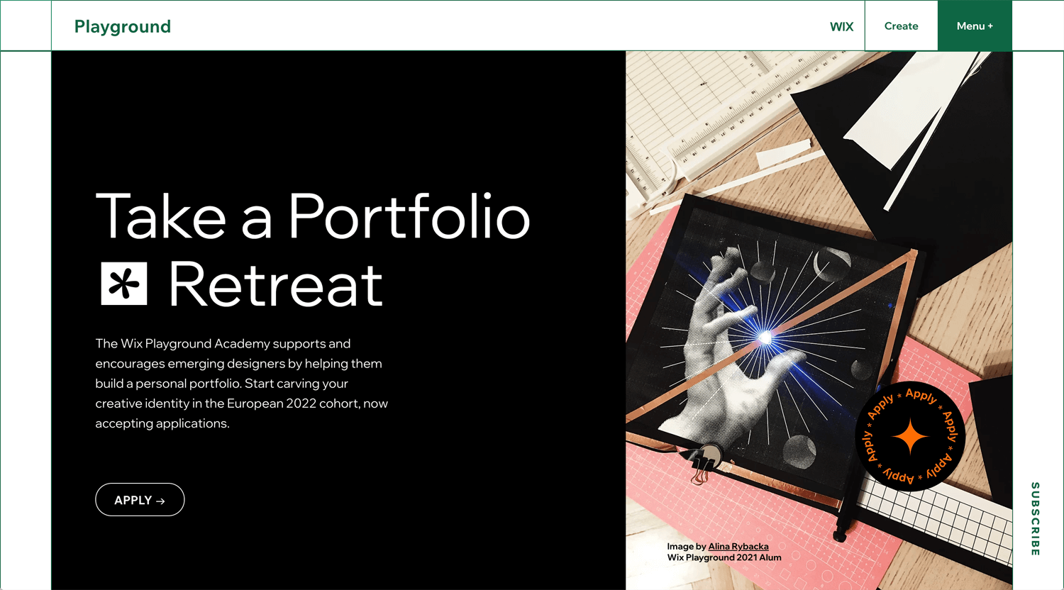
©Wix
I searched Wix website references. Most cases are Wix blog and the website which picked up are Wix playground students. I want to find more generic website, not a portfolio.
Conclusion: To be continued
I learned Wix in October 2021. I don’t know how much the client is willing to pay for the Wix website. I need to research for a couple of months. In 2022, I would like to find 3 new clients which want to develop a website by the Wix.
Let’s Study Together
Tell Me About Your Thought
I am learning the business of design as a freelance. I would like to hear your story based on an experience. Please send a comment or opinion. I will reply to you shortly.
